CORNERSTONE
CORNERSTONE
PROJECT OVERVIEW
Client: Cornerstone Employee Benefits
Project: Logo & Branding Development
Cornerstone Employee Benefits, a consulting firm specializing in employee benefits, needed a brand identity that conveyed trust, reliability, and professionalism. The goal was to create a visual identity that would resonate with corporate clients, reflecting the firm’s commitment to providing solid, dependable advice and solutions.
Design Process
Strategic Alignment
The foundation of Cornerstone Employee Benefits’ brand was built upon the concept of a cornerstone - a fundamental element in construction that symbolizes strength, stability, and reliability. The client emphasized how crucial cornerstones are to the integrity of the building, and they wanted this metaphor to resonate throughout the brand, reflecting the stability, and security that they offer their corporate clients. These values are critical in the employee benefits industry, where companies must feel assured that their benefits provider is not only knowledgable but also steadfast. The metaphor of a cornerstone became a guiding principle, representing the company as a foundational element in the success and well-being of its clients’ businesses. This metaphor guided every aspect of the brand’s development, ensuring that the visual identity and messaging consistently communicated the company’s role as a reliable and essential partner.
Concept Development
To capture the essence of Cornerstone, I explored concepts that revolved around themes of strength, reliability, and clarity. The name “Cornerstone” itself inspired the idea of foundational support, which guided the development of the visual identity. I aimed to create a brand that would stand out in the industry while also feeling familiar and reassuring to clients.
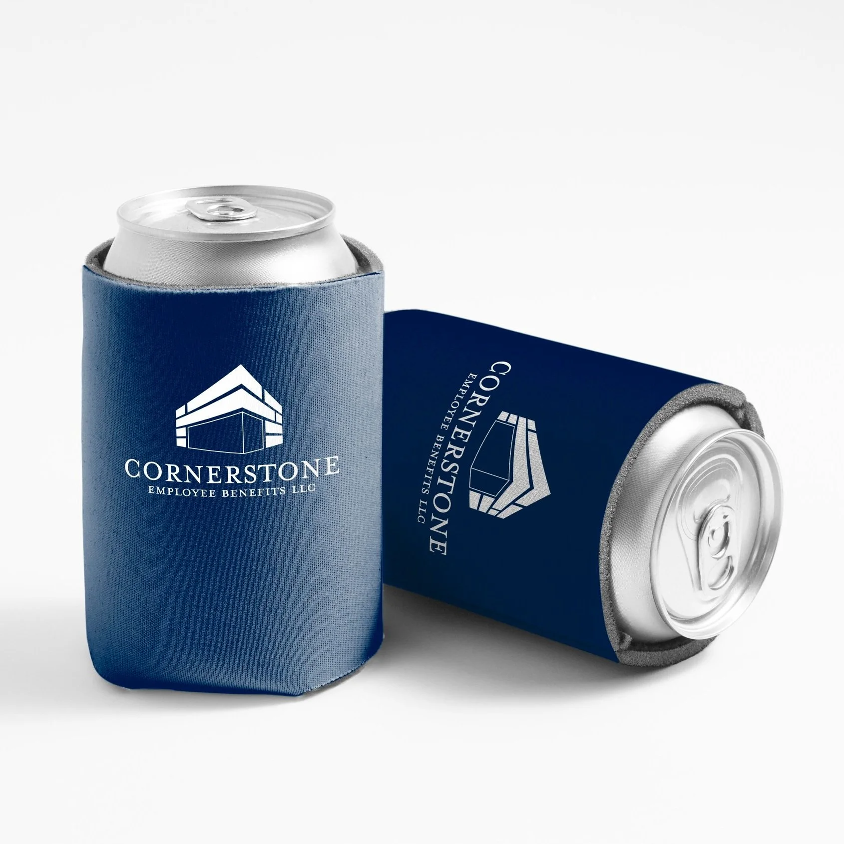
Logo Development
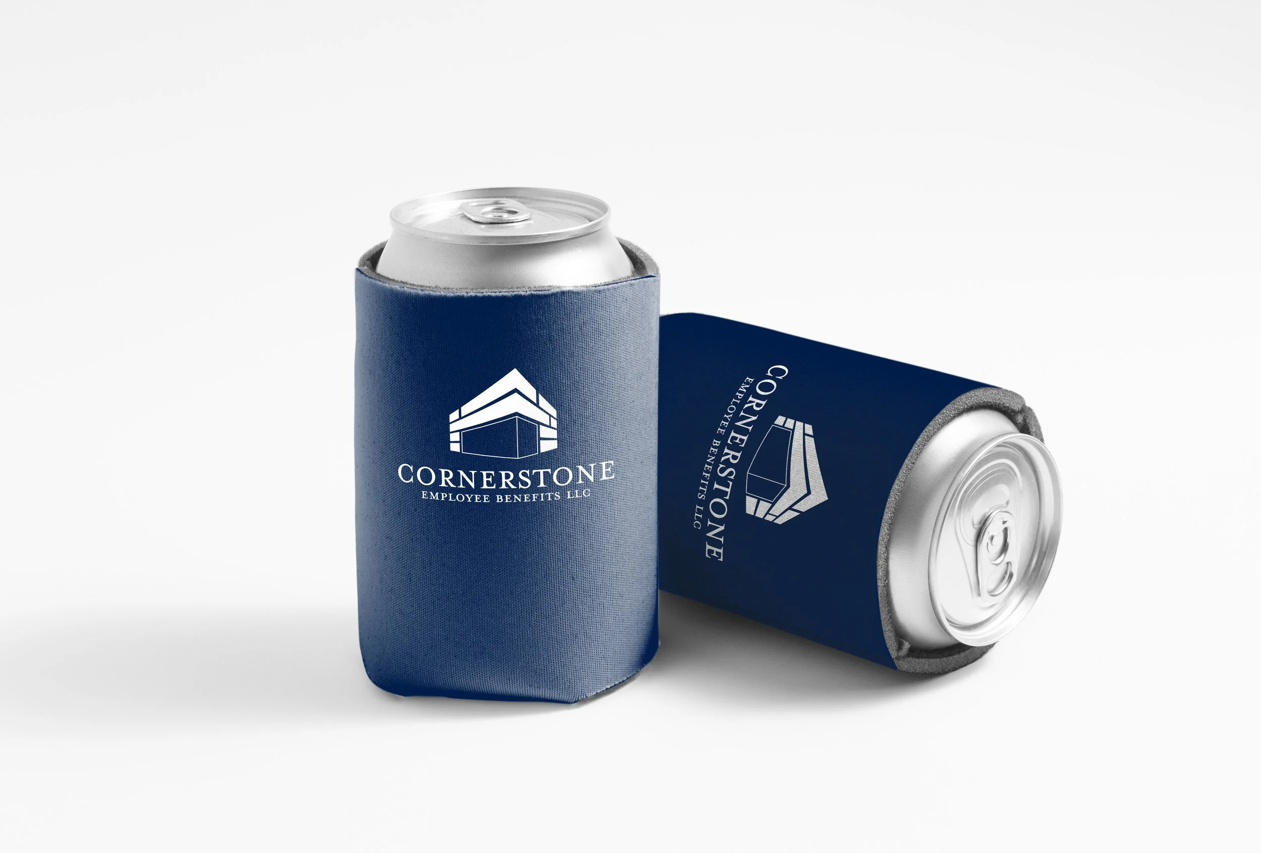
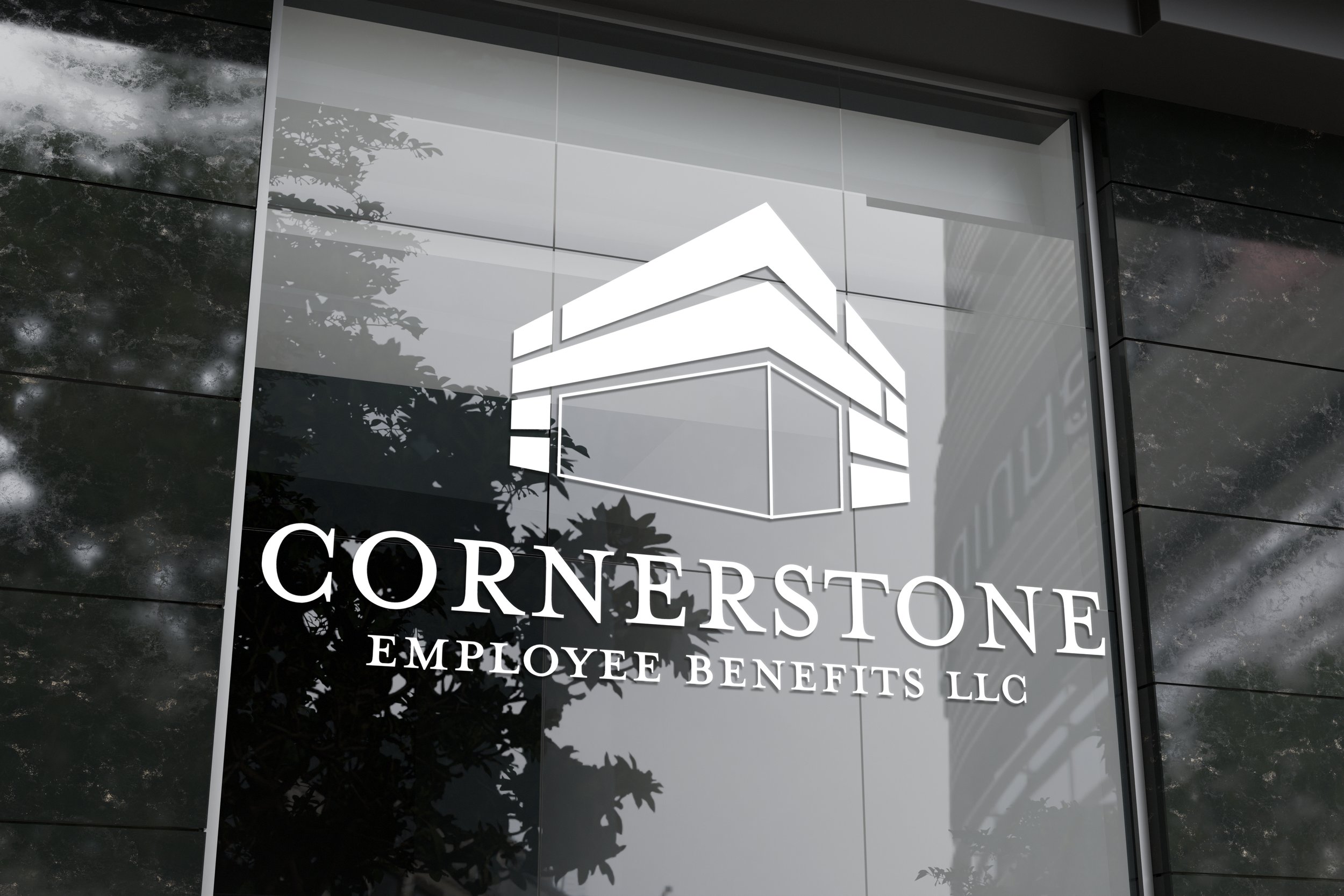
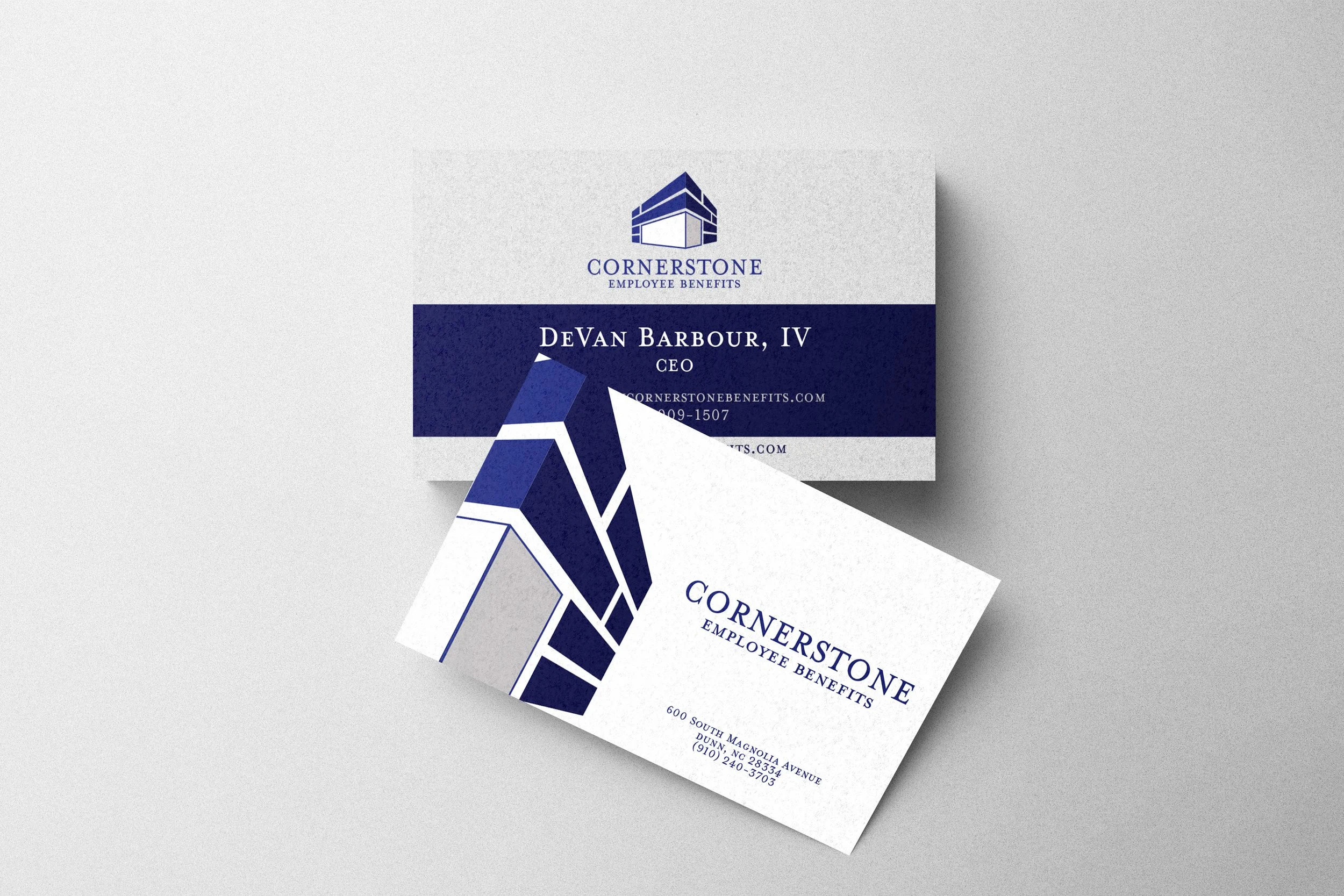
The logo design was inspired by the concept of a cornerstone - something strong and foundational. The primary logo is clean and straightforward, with a bold geometric form that symbolizes the stability and strength that Cornerstone offers its clients. The classic elegance of Mrs. Eaves Raman provides a touch of sophistication.

Typography and Color Palette
Typography plays a critical role in communicating the brand’s message. Montserrat was selected for its modern, clean line and versatility, making it ideal for both digital and print applications. It’s used across all weights to ensure flexibility while maintaining consistency. Mrs. Eaves Roman adds a traditional touch, highlighting the firm’s dedication to excellence and precision, which are vital qualities in the consulting industry.
The color palette was selected to convey trust and stability. The primary colors, Navy Blue and Midnight Blue, were chosen for their association with professionalism, reliability, and authority. These deep, calming hues, create a sense of security, which is exactly what Cornerstone aims to provide. Lighter tones such as Rhino Gray and Pearl Gray were added to the palette to provide balance and ensure the brand remains approachable and not overly rigid. Bright White serves as a clean and crisp contrast, keeping the brand modern and fresh.
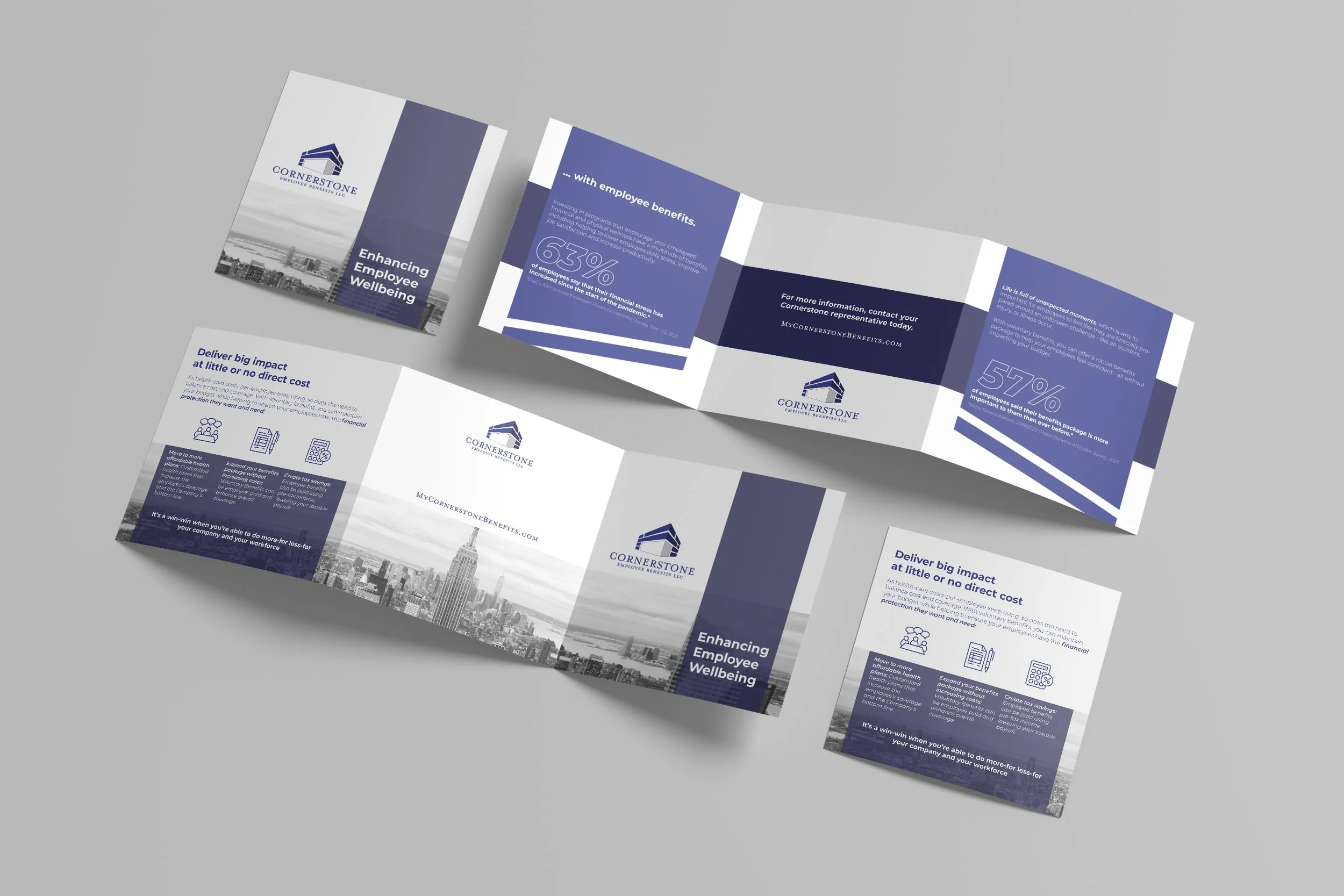
Visual Consistency
Maintaining visual consistency across all brand touch points was a priority to ensure that cornerstone is recognized as a cohesive and professional entity. Whether its’s a business card, brochure, presentation, or digital assets, the brand’s visual elements work together seamlessly to reinforce its identity. The use of structured grids and clean layouts further emphasizes the firms commitment to clarity and organization.
The final branding for Cornerstone Employee Benefits is a reflection of the firm’s dedication to providing steadfast support and expert guidance. Every design element was created to communicate reliability, professionalism, and trustworthiness, making Cornerstone a brand that clients can confidently rely on in the complex world of employee benefits.
This project was an excersize in blending modern design with the timeless principles of trust a reliabilty. The result is a brand identity that not only stands strong in a competitive market but also provides a visual reassurance to clients seeking a dependable solution for their needs.