EVERBLOOM
EVERBLOOM
PROJECT OVERVIEW
Client: Everbloom Pelvic Health
Project: Logo & Branding Development
Everbloom Pelvic Health, a clinic dedicated to women’s pelvic health, sought a logo & brand identity that would embody both professionalism and a sense of nurturing care. The challenge was to create a visual identity that conveyed expertise in a sensitive area of healthcare while remaining warm and approachable, fostering trust and comfort for patients.
Design Process
Empathy-Driven Research
The design process for Everbloom Pelvic Health began with a deep dive into the understanding of needs the clinic’s patients might have. Given the sensitive nature of pelvic health, it was crucial that the brand resonate not only with the practical aspects of medical care but also with the emotional support that patients often seek during their health journey. My research highlighted the importance of creating a brand that felt safe, supportive, and empowering. Patients needed to feel that Everbloom was a place where they could be heard, cared form and treated with the utmost respect and dignity. I focused on how color, typography, and imagery could influence patient comfort and perception. I also conducted a thorough analysis of branding strategies used by other healthcare providers, particularly those specializing in women’s health. This process helped identify what visual elements were commonly used to convey empathy and trust, and where there were opportunities for Everbloom to differentiate itself. This in-depth approach to empathy-driven research ensured that every aspect of Everbloom’s brand was designed with the patient’s experience in mind.
Concept Development
The next step was to translate the insights from the research into visual concepts that reflected the clinic’s mission. The name Everbloom inspired imagery related to growth, renewal, and care - key themes in women’s health. I focused on developing a brand identity that would symbolize these concepts through the use of organic shapes, soothing colors, and gentle typography, ensuring that the brand would feel supportive and empowering.

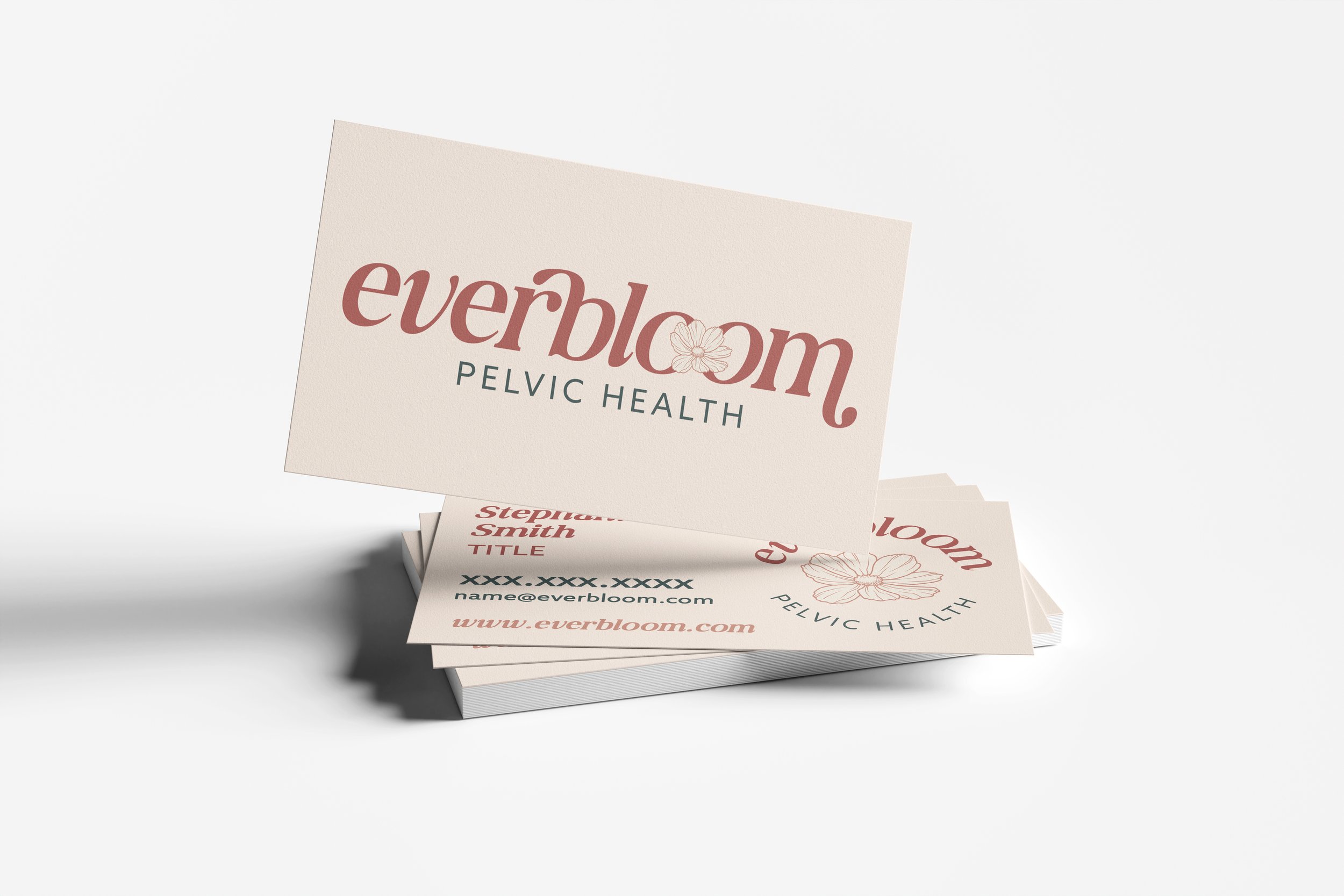
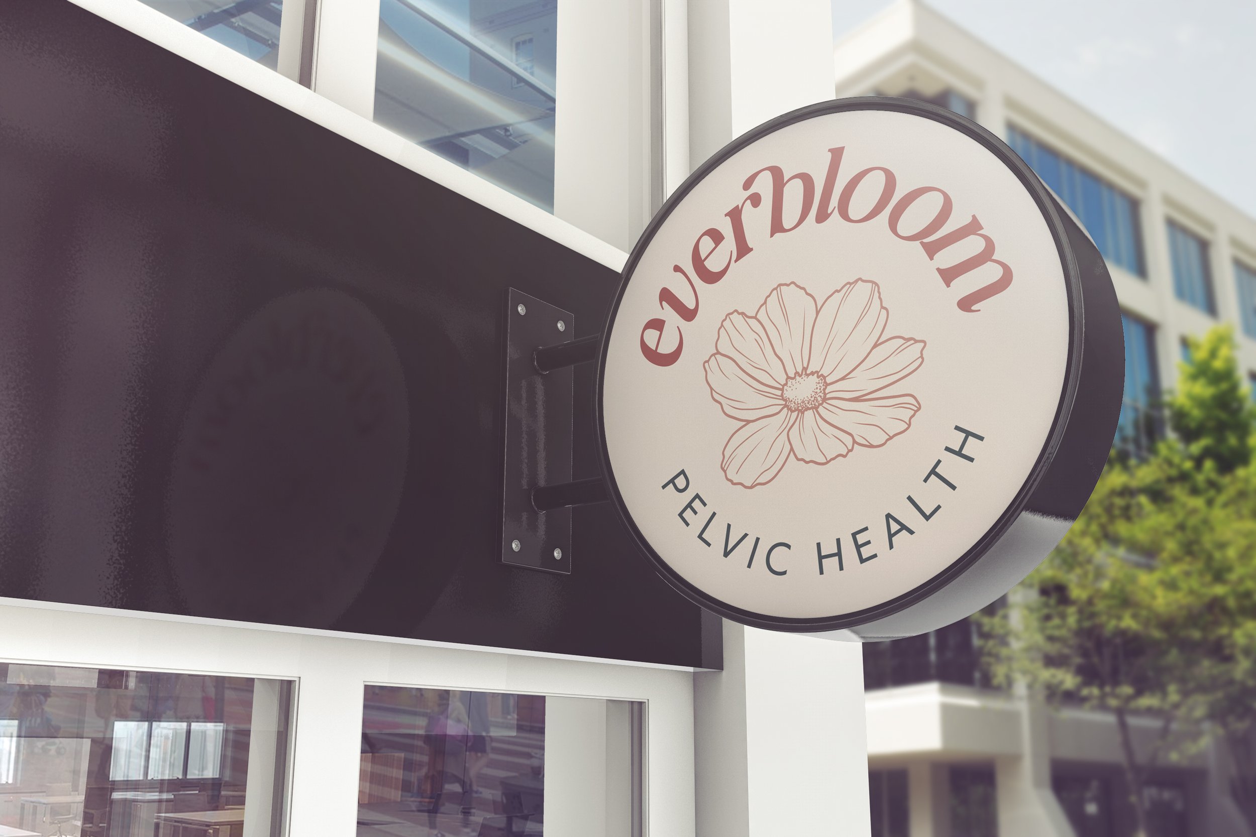
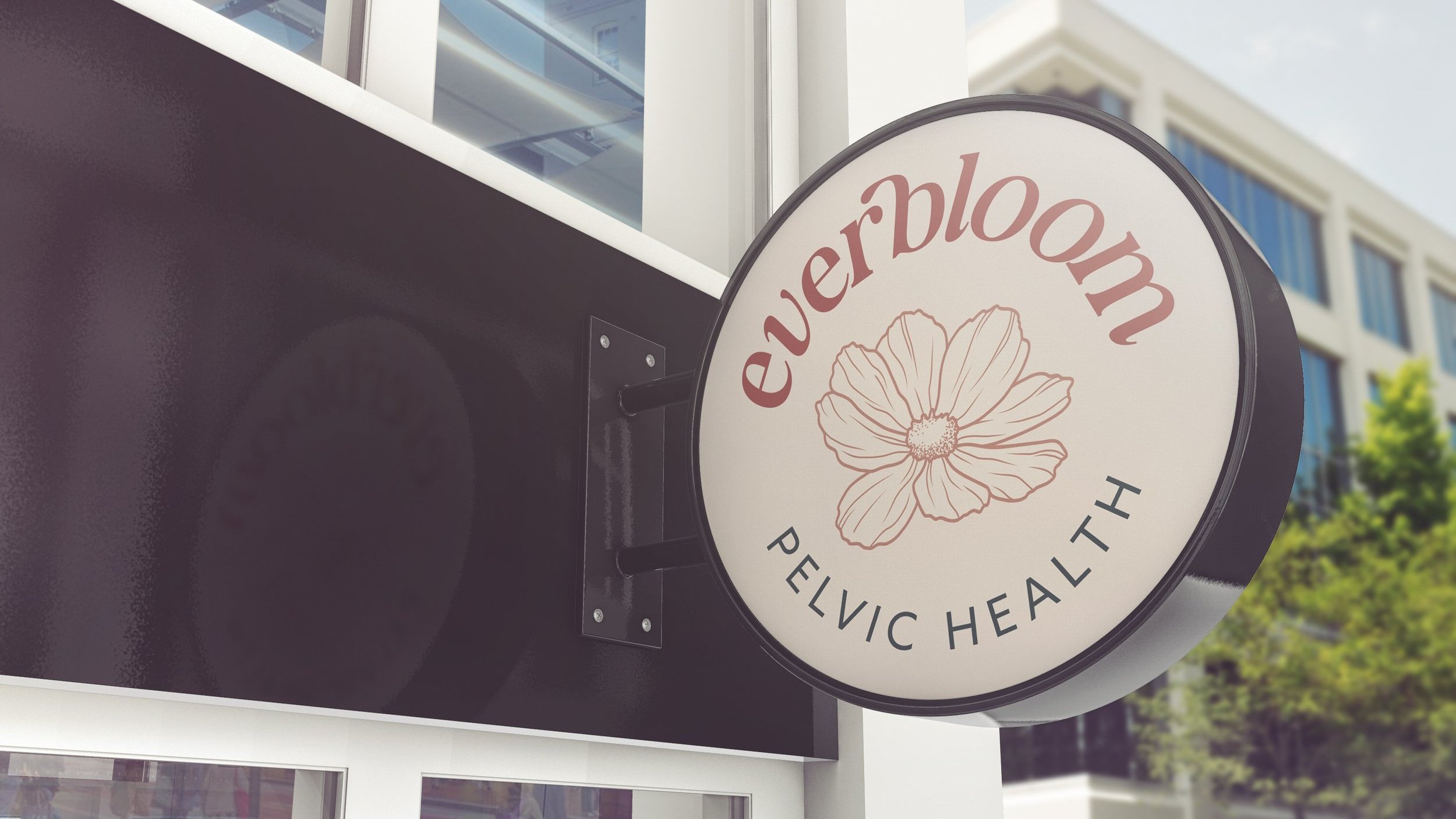
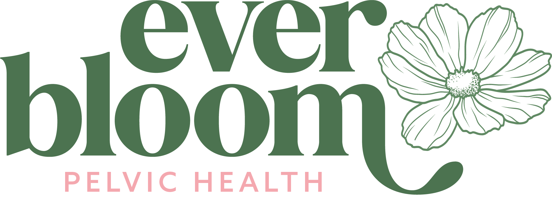
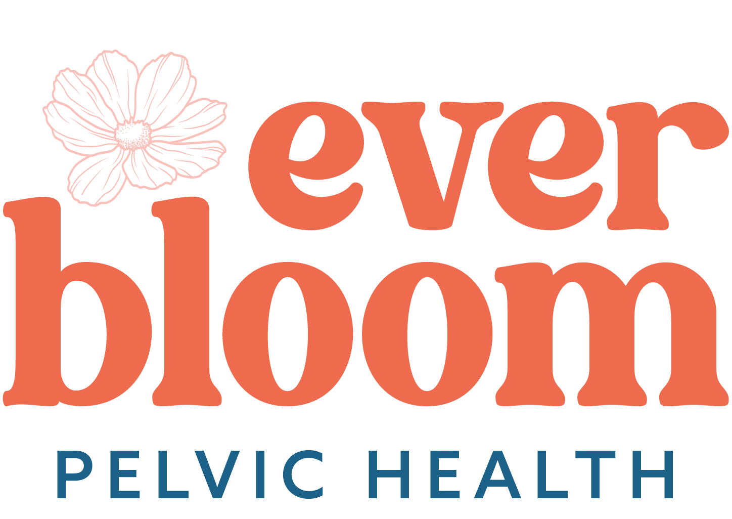
Logo and Icon Design
The primary logo and accompanying secondary logo and icon were crafted to evoke the ideas of growth and flourishing. The design features soft, flowing lines that suggest the gentle, nurturing care provided by Everbloom. The organic flower form within the logo symbolize both the natural aspects of health and the clinic’s commitment to helping women thrive during this chapter of their lives. The design choice reinforces the brand’s connection to nature, health, and holistic well-being.
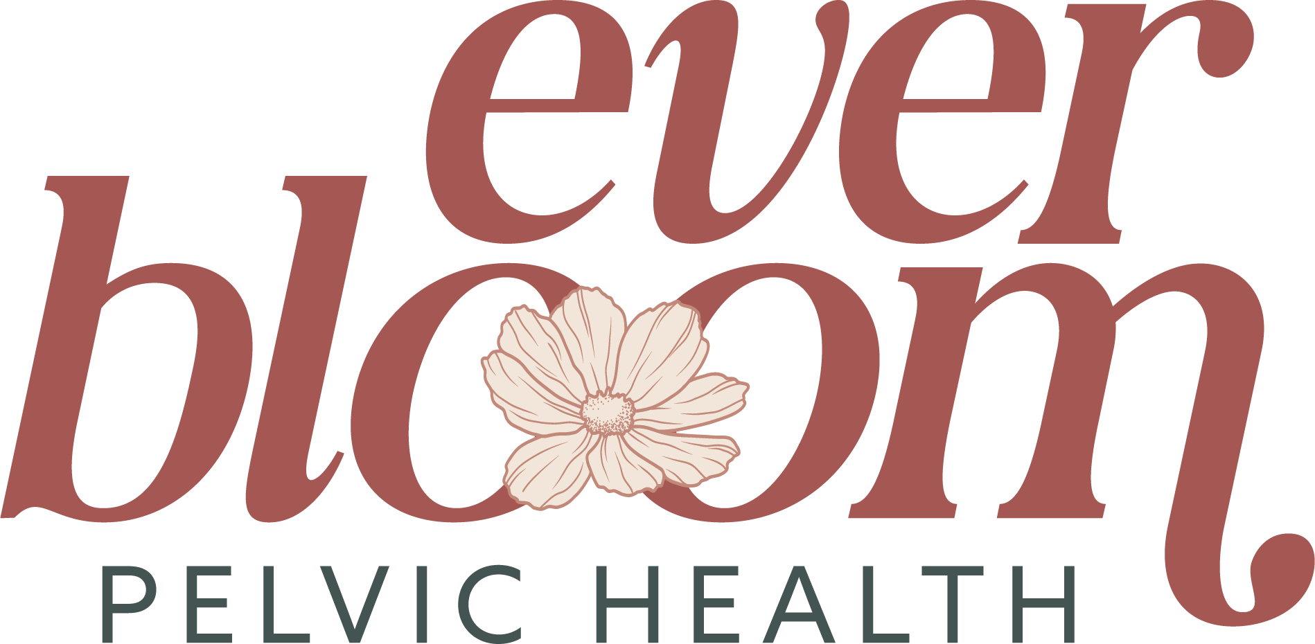
Typography and Color Palette
Typography was another crucial element in establishing Everbloom’s brand voice. The chose of WS Paradose Italic for headlines and key brand messages introduces a touch of elegance and femininity, which is important for connecting with the target audience. Azo Sans Regular was chosen for body text to ensure clarity and readability, maintaining a clean and modern appearance that is both professional and approachable. The contrast between these typefaces supports the brand’s dual focus on care and expertise.
The color palette was carefully curated to evoke warmth, trust, and calmness. Terracotta and Redwood, the primary colors, bring a sense of grounded warmth, symbolizing the clinic’s supportive environment. These are complemented by softer hues like Linen and Goldilocks, which add a gentle, reassuring tone to the brand, making it feel accessible and inviting. Evermore, a deep, calming shade, provides contrast, reinforcing the seriousness and professionalism of the clinic’s services. This combination of colors were selected to create a balanced visual experience that is both comforting and professional.

The final branding for Everbloom Pelvic Health reflects a careful balance between professionalism and empathy. The visual identity was designed to create a space where patients can feel both cared for and confident in the expertise of the clinic. Every design decision, from the organic forms in the logo to the warm, nurturing color palette, was made with the intention of making Everbloom a beacon of support and trust in women’s pelvic health.
Working on the Everbloom Pelvic Health branding was a profound experience that emphasized the importance of empathy in design. This project allowed me to explore how visual elements can be used to communicate care and comfort, reinforcing the brand’s commitment to helping women lead healthy, fulfilled lives.